Table of Contents
ToggleFinal Fantasy VII landed on PlayStation in 1997 and changed gaming forever, not just for its story and gameplay, but for how it pushed the boundaries of what a game’s visual presentation could achieve. The art of Final Fantasy VII wasn’t just window dressing: it was foundational. From Cloud’s distinctive spiky blonde hair to Midgar’s gritty, industrial landscape, every visual choice communicated something essential about the game’s world and characters. Today, nearly three decades later, FFVII’s art direction remains a masterclass in how limitations breed innovation and how a cohesive aesthetic can define an entire generation of gaming. Whether you’re revisiting the original or experiencing the modern remake, understanding the artistic vision behind Final Fantasy VII reveals why this game’s visuals still hold up and inspire developers everywhere.
Key Takeaways
- Final Fantasy VII’s art direction revolutionized game visuals by using polygonal limitations and pre-rendered backgrounds to create a distinctive hybrid 2D/3D aesthetic that remains iconic after nearly 30 years.
- Character designs like Cloud’s spiky blonde hair and Sephiroth’s imposing silver-haired frame demonstrate how thoughtful silhouettes and color palettes communicate personality and narrative intent without exposition.
- Midgar’s visual identity—industrial gothic architecture, oppressive Plate design, and stark contrast between sterile corporate facilities and authentic slums—reinforces the game’s core themes of class struggle and corporate exploitation.
- Yoshitaka Amano’s concept art served as the artistic foundation for Final Fantasy VII art direction, establishing a visual language flexible enough to evolve across PS1, PS5, and modern remakes while remaining instantly recognizable.
- The Final Fantasy VII Remake successfully preserved the original’s artistic vision by reinterpreting Amano’s concepts with modern technology rather than simply upscaling, proving that great game art transcends technical constraints through clear intent and thoughtful composition.
The Visual Foundation: Original 1997 Art Direction and Design
Polygonal Limitation and Creative Innovation
When Final Fantasy VII launched on the original PlayStation, 3D gaming was still finding its feet. The hardware could only handle so many polygons per frame, which meant character models on the field had maybe 300–500 polygons total, a far cry from modern standards. This brutal constraint forced the team at Square (now Square Enix) to get creative.
Character sprites were pre-rendered 3D models that had been rotoscoped and compressed into 2D sprites for the overworld, a technique that gave them a unique look, crisp yet dimensional. When you’re in towns or exploring the world, Cloud doesn’t look like a typical 2D sprite or a full 3D model. He’s somewhere in between, which created an aesthetic that’s still unmistakably FFVII. This hybrid approach meant the art team could control exactly how characters looked from every angle, ensuring consistency and impact.
The actual battle sequences used true 3D models, which were more detailed than their overworld counterparts but still limited by ’90s hardware. Yet somehow, this limitation made the battles feel special, a visual upgrade that signaled to the player that things were about to get serious. The transition between exploration and combat became visually distinct, raising the stakes without a word of dialogue.
The Pre-Rendered Backgrounds That Defined a Generation
If character limitations pushed innovation, the backgrounds showcased what’s possible when artists have a different kind of freedom. Final Fantasy VII’s environments are pre-rendered 3D backgrounds, meaning artists created full 3D scenes, rendered them offline at high quality, and then used those static images as the game’s backdrop. This approach let the development team achieve visual fidelity that real-time rendering simply couldn’t match on 1997 hardware.
Midgar’s streets, the slums, even the inside of the Sector 7 plate, all of these were crafted with incredible detail. You’d see depth, lighting, shadows, and atmospheric effects that made the world feel tangible. The pre-rendered approach also meant the artists could layer in cinematic lighting and composition that guided the player’s eye naturally through each scene. This is why walking through Midgar in 1997 felt so immersive even though the technical constraints.
The downside? You couldn’t have truly dynamic camera control. The perspective was largely fixed, and environments were designed with specific sightlines in mind. This limitation actually strengthened the game’s visual language, it became more like exploring a living diorama or a series of carefully composed paintings rather than a fully 3D space. That painterly quality is a huge part of FFVII’s enduring charm.
Character Design: Defining Memorable Protagonists and Antagonists
Cloud Strife and the Spiky-Haired Revolution
Cloud Strife’s design is so iconic it practically became the template for a generation of JRPG protagonists. The spiky blonde hair, the oversized Buster Sword, the military-style uniform mixed with a skirt, it shouldn’t work, and yet it’s instantly recognizable. Character designer Tetsuya Nomura crafted Cloud to stand out on screen even with limited polygon budgets. Those spikes aren’t just a stylistic flourish: they’re a visual metaphor for Cloud’s personality: sharp, aggressive, and pointed in a way that immediately signals he’s not your typical hero.
What’s interesting is how Cloud’s design has evolved across different FFVII media. In the original 1997 game, his proportions were more exaggerated to work within the technical constraints, the head was larger relative to the body to ensure it remained recognizable in the small pre-rendered sprites. By the time the Remake arrived in 2020, the same character could be rendered with realistic proportions while maintaining all the visual elements that make him unmistakably Cloud. That consistency across nearly 25 years of different hardware generations speaks to how fundamentally sound his design is.
Aerith, Sephiroth, and the Supporting Cast
Aerith Gainsborough presents a fascinating contrast to Cloud. While Cloud is all sharp edges and aggressive geometry, Aerith’s design emphasizes softness and movement. Her long pink hair, the flowing pink dress, and her gentle facial features create a character who visually communicates vulnerability and grace. Even her combat animations in the original game are noticeably different, where Cloud thrusts and slashes, Aerith’s attacks flow and float. This visual language communicates her role as a healer and her place in the story without explicit exposition.
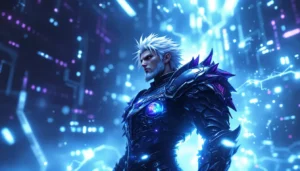
Sephiroth is a masterclass in intimidating character design. The long silver hair, the impossibly tall frame (he’s 6’1″, but the proportions make him seem even taller), the black coat, and that one-winged model design, every element reinforces that he’s something other, something wrong, something dangerous. When Sephiroth appears in a scene, the visual hierarchy makes it impossible not to focus on him. Nomura designed him to be the opposite of Cloud in nearly every way: tall where Cloud is compact, flowing where Cloud is sharp, elegant where Cloud is military.
The supporting cast, Barret Wallace, Tifa Lockhart, Red XIII, Yuffie Kisaragi, each has a distinctive silhouette and color palette that makes them instantly identifiable. This is functional character design. In a turn-based battle system where you might be scanning four character portraits simultaneously, clear visual differentiation matters. But it’s also effective storytelling. Barret’s massive frame and gun-arm immediately communicate he’s a powerhouse. Tifa’s martial arts gi and gloves signal combat prowess without words. Red XIII’s beast-like form makes him visually alien, underscoring that he’s not human. These designs work on multiple levels.
Materia and Magic: The Visual Language of FFVII’s Battle System
Materia, those glowing orbs that grant magical abilities, are objects of mechanical importance and visual poetry. The spherical shape, the soft glow, the way they’re colored by ability type: all of this is intentional design. When you equip Materia, you’re literally slotting these luminescent objects into weapon slots, and that animation carries weight. The visual feedback of a Materia glowing brighter as you use it in battle creates a tangible sense of progression and power.
The color coding is essential to the visual language. Green Materia for healing magic, red Materia for offensive spells, blue Materia for support abilities, at a glance, you know what each one does. This isn’t coincidental or arbitrary. Square’s art team understood that good UI design and good visual design are inseparable. When Aerith pulls out Holy (a white-colored Materia), the visual language tells you this is something special, something pure and powerful.
In battle, magic effects were rendered with practical constraints but maximum impact. Meteor summons crashing meteors from the sky with visible particle effects. Ultima fills the screen with overwhelming light. Knights of Round has the summon appear behind the party in a massive, imposing frame. These spell animations became iconic, people remember them decades later. The spell effects managed to look powerful and impressive even though technical limitations, which is a testament to the animation and particle effect work that went into them.
Miss these visual cues, and you miss a whole layer of game design. The UI doesn’t just function: it’s beautiful. The battle interface uses a slightly futuristic aesthetic with glowing borders and clean typography that makes scanning information quick and satisfying. This is why later remakes take Materia seriously as a visual element, it’s not just a mechanical system, it’s an artistic cornerstone of FFVII’s identity.
Midgar’s Urban Aesthetics: Environmental Art and World Design
Industrial Gothic Architecture and Plate Design
Midgar isn’t just a setting: it’s a character itself. The city’s visual identity, industrial gothic mixed with steampunk elements and corporate brutalism, creates a world that feels both technologically advanced and deeply corrupt. The massive Plate that sits above the slums is the perfect visual metaphor. This enormous steel structure, supported by pillars as tall as buildings, literally blocks out the sun from the lower city. You don’t need dialogue to understand class stratification in Midgar: you can see it.
The design draws from real-world architecture, 1930s industrial cities, modern corporate centers, and dystopian sci-fi. Reactors are enormous structures with pipes and vents, covered in rust and corrosion, visually communicating they’re extracting something vital from the planet. Shinra’s headquarters is a gleaming tower that dominates the skyline, all clean lines and polished surfaces, a complete visual contrast to the gritty reality of the streets below. This architectural contrast reinforces the game’s central theme: the exploitation of the many for the benefit of the few.
The environmental art also includes smaller details that build the world. Propaganda posters featuring the Shinra Electric Power Company appear throughout Midgar. Gas masks and air filters are visible on buildings, a visual reminder of the pollution problem. The streets have graffiti, worn textures, and signs of decay. These details accumulate to create an environment that feels lived-in and oppressive, even on PS1 hardware limitations.
The Slums and the Stark Contrast of Rich and Poor
The slums of Sector 7 (and later Midgar’s other districts) present the opposite aesthetic from the upper plate. Where Shinra’s areas are sleek and corporate, the slums are made of corrugated metal, salvaged materials, and jury-rigged structures. Stores are cramped and cluttered. Homes are barely more than shacks constructed under the Plate. Neon signs create pockets of color in otherwise grey and brown environments.
But here’s where the art direction gets interesting: the slums aren’t portrayed as irredeemably bleak. There’s life here. People gathering, shops operating, community present. The color palette shifts from the corporate blues and greys of Shinra facilities to warmer tones, browns, oranges, and the reds of neon signs. This visual language communicates that even though poverty and hardship, there’s humanity and hope in the slums that’s absent from the sterile upper city.
The Sector 7 explosion scene, one of the game’s most pivotal moments, hits harder because you’ve spent time in this community. You’ve walked these streets. The environmental art made you care about a location, which made the destruction of it emotionally resonant. That’s the power of strong environmental design. When players explore Final Fantasy VII today, many still comment on how atmospheric Midgar feels even though the technical limitations. That atmospheric quality comes almost entirely from the art direction and environmental design choices made by the team.
Yoshitaka Amano’s Influence: Concept Art That Shaped the Game
Yoshitaka Amano is Final Fantasy’s visual architect. As the series’ primary character designer since the beginning, Amano’s watercolor-inspired aesthetic became synonymous with Final Fantasy itself. For FFVII, Amano created the concept artwork that served as the foundation for everything the development team built. His paintings aren’t just pretty pictures: they’re design blueprints that communicate tone, personality, and narrative intent.
Amano’s Cloud design, rendered in his signature style with flowing lines and watercolor washes, established the character’s fundamental look. Even with significant changes made during production (the Buster Sword got larger, the proportions shifted), the core essence of Amano’s design remained. This is remarkable because Amano was working from a brief, he wasn’t designing for a game yet, he was imagining possibilities. The fact that his vision translated so directly to playable form speaks to how well he understood what would work as a character in a video game context.
Amano’s concept art for Midgar shows the city as even more elaborate and visually complex than what made it into the final game. His paintings feature detailed architectural elements, intricate environmental storytelling, and a sense of scale that clearly influenced the pre-rendered backgrounds the art team created. When you look at concept art from FFVII and then play the game, you can see how much the development team used Amano’s work as visual reference and inspiration.
Beyond individual characters, Amano’s watercolor technique influenced the overall aesthetic philosophy of FFVII. Even though the game uses pre-rendered 3D and polygonal characters, there’s a painterly quality to how it all comes together. This is partly technical (the limitations inherent in ’90s rendering), but it’s also intentional. The art team was trying to capture the essence of Amano’s concept work, that fusion of realism and stylization, of precision and fluidity.
Amano’s influence extends beyond FFVII’s original release. When the Remake was being developed, Amano’s work was again a touchstone. The modern character designs need to feel like contemporary versions of his concepts, recognizable but evolved. This continuity is part of why FFVII’s character designs have remained consistent across 25+ years and multiple hardware generations. Amano established a visual language that’s flexible enough to accommodate technical evolution while strong enough to remain instantly recognizable. Looking at discussions on sites like Gematsu, where Japanese game design is frequently analyzed, Amano’s influence on modern JRPGs is consistently highlighted as foundational.
The Remake Era: FFVII Remake and Rebirth’s Modern Art Direction
Real-Time Graphics and Character Model Evolution
When Final Fantasy VII Remake released in 2020, the jump in visual fidelity was staggering, and intentional. The original game had to work with PlayStation 1 hardware that could render maybe 300-500 polygons per character. The Remake characters are rendered with millions of polygons, allowing for realistic hair, fabric simulation, facial expression detail, and eye movement that conveys emotion. Cloud’s hair now flows dynamically. You can see the stitching on his jacket. His eyes can convey subtle emotions that the original sprite could never achieve.
But here’s the crucial part: the core design remained recognizable. Cloud still has the spiky blonde hair, the Buster Sword, the military uniform with the skirt. Sephiroth still towers over everyone with his silver hair and one-winged model. What changed is the execution, more realistic, more detailed, more emotionally expressive. The art team had to make those original designs work in a photorealistic context, which required rethinking proportions and materials.
The character model work in the Remake became so detailed that it influenced how Final Fantasy VII Rebirth (the upcoming PS5 exclusive) was developed. The team had established a new baseline for what FFVII characters could look like with modern technology. The challenge shifted from “can we make this character look like the original?” to “how do we maintain consistency while continuing to improve?”
Real-time rendering also enabled dynamic camera work impossible in the original. Instead of fixed perspectives and pre-rendered backgrounds, the Remake features a full 3D camera that can move freely through scenes. This is both a technical achievement and an artistic choice, it makes the game feel more cinematic, more intimate. You can approach characters from different angles. Environmental details can be explored more thoroughly. It’s a fundamentally different way of experiencing the same world.
Preserving the Original Vision While Embracing Modern Technology
The biggest challenge the Remake faced wasn’t technical, it was artistic. How do you adapt a game whose visual style was so defined by its technical limitations? The solution was reinterpretation rather than simple upscaling. The art team studied Yoshitaka Amano’s concept work heavily, treating those paintings as the “true” designs and the original game as one valid interpretation of them. This freed the Remake to create new interpretations that felt authentic to the original vision while being visually contemporary.
Midgar in the Remake is visually grander and more detailed than the original, but the core aesthetics remain. Industrial gothic architecture, corporate sterility contrasted with slum authenticity, the oppressive Plate blocking out the sky, all still present, just rendered with modern techniques. The color palette is richer. Environmental storytelling is more detailed. But you’d still recognize it as Midgar.
One of the smartest choices was how the Remake handled the distinctive pre-rendered background aesthetic. Modern games don’t really use that technique anymore, everything is real-time rendered. But the Remake understood that those pre-rendered backgrounds contributed to FFVII’s visual identity. The solution was to create real-time environments with a compositional sophistication that echoed the original’s visual design. Camera angles are still thoughtful. Lighting guides your eye. The environments feel designed, not procedurally generated.
As developments have progressed through 2025 and into 2026, further remakes and re-releases have continued this philosophy. According to coverage on Polygon, the approach to adapting classic games has shifted toward finding the artistic intent behind the original designs rather than simply making them more detailed. FFVII pioneered this approach, understand the original’s aesthetic philosophy, then find ways to honor it with contemporary technology and techniques.
The Remake also introduced physics-based rendering, realistic fabric simulation, and dynamic lighting that made the world feel more tactile. When you see cloth move realistically, when light bounces off surfaces correctly, when hair responds to movement and wind, the environment feels more alive. This technology serves the art direction rather than replacing it. The fundamental visual identity of FFVII remained the priority, with technology as the tool to enhance it rather than transform it.
Conclusion
Final Fantasy VII’s art direction was revolutionary in 1997, and it remains a case study in how limitations breed innovation and how thoughtful design transcends technical constraints. From the hybrid 2D/3D character presentation to the painstakingly detailed pre-rendered backgrounds, from Tetsuya Nomura’s character designs to Yoshitaka Amano’s conceptual vision, every artistic choice communicated something essential about the game’s world and story.
What’s remarkable is how these artistic decisions have held up across multiple hardware generations. The core designs remain recognizable and compelling whether they’re rendered with 300 polygons on PS1 or millions on PS5. The environmental aesthetics still work, still communicate the themes of class struggle and corporate corruption. This longevity isn’t accidental, it comes from art direction grounded in clear intent and execution driven by the constraints and possibilities of the available technology.
For anyone interested in game art direction, character design, or environmental storytelling, FFVII offers endless lessons. The original game shows what’s possible when limitations force creativity. The Remake shows how to honor artistic vision while embracing technological evolution. Together, they demonstrate that great game art isn’t about polygon counts or shader techniques, it’s about clear communication, thoughtful composition, and designs that work across different contexts and platforms. That philosophy is why FFVII’s visual world, created nearly 30 years ago, continues to inspire and influence game artists today. Whether you’re revisiting the original or experiencing the Remake, the artistry that shaped these games remains as striking as ever.